Display Dimensions
Display Sizes
Desktop

| Width | Height |
|---|---|
| 2560 px | 1440 px |
| 1920 px | 1080 px |
| 1680 px | 1050 px |
| 1600 px | 900 px |
| 1440 px | 900 px |
| 1366 px | 768 px |
| 1360 px | 768 px |
| 1280 px | 800 px |
| 1024 px | 768 px |
Laptop

| Width | Height |
|---|---|
| 1920 px | 1200 px |
| 1600 px | 1200 px |
| 1680 px | 1050 px |
| 1400 px | 1050 px |
| 1280 px | 1024 px |
| 1440 px | 900 px |
| 1280 px | 800 px |
| 1024 px | 768 px |
| 800 px | 600 px |
Tablet
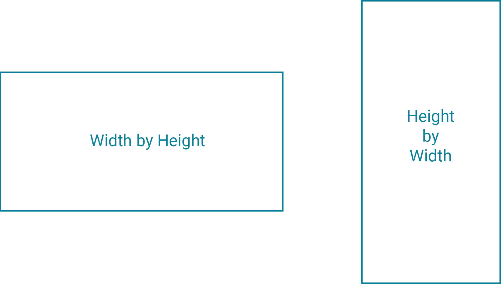
Remember: All tablet sizes and styles have two orientations, Portrait and Landscape.
Width by Height, or Height by Width.

| Devices | Width | Height |
|---|---|---|
| Apple iPad Pro | 1366 px | 1024 px |
| Apple iPad | 1024 | 768 px |
| Apple iPad Mini | 768 px | 1024 px |
| Microsoft Surface Pro 4 | 2736 px | 1824 px |
| Amazon Kindle Fire | 1280 px | 800 px |
Mobile
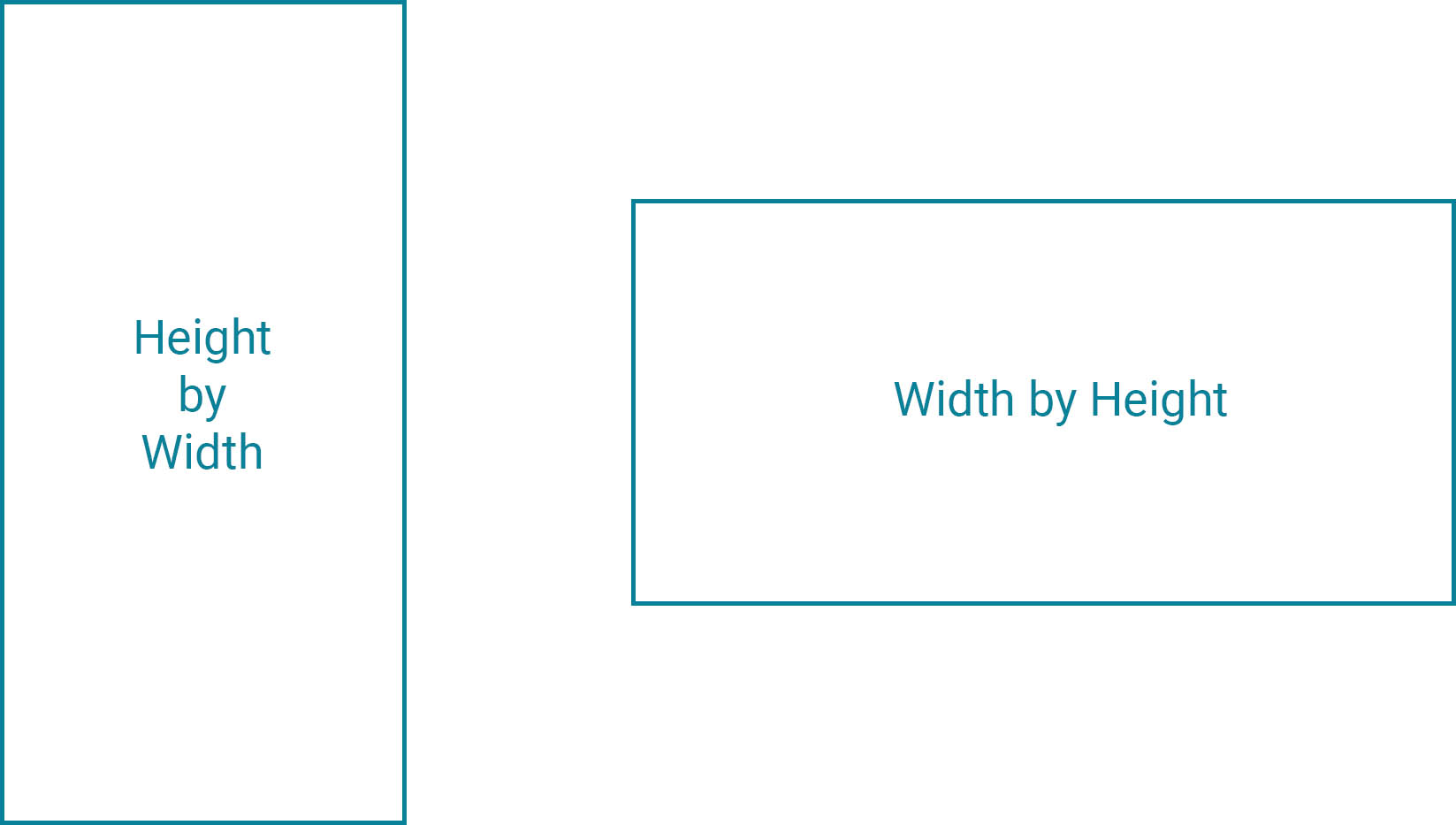
Remember: All mobile sizes and styles have two orientations, Portrait and Landscape.
Height by Width, or Width by Height.

| Devices | Height | Width |
|---|---|---|
| Apple iPhone X | 812 px | 375 px |
| Apple iPhone 6/7/8 Plus | 736 px | 414 px |
| Apple iPhone 6/7/8 | 667 px | 375 px |
| Apple iPhone 5/SE | 568 px | 320 px |
| Apple iPhone 4 | 480 px | 320 px |
| Google Pixel 2 XL | 823 px | 411 px |
| Google Pixel 2 | 731 px | 411 px |
| Samsung Galaxy S7 | 640 px | 360 px |
| Samsung Galaxy S6 | 732 px | 414 px |
| Samsung Galaxy S5 | 640 px | 360 px |
| Samsung Galaxy J7 | 640 px | 360 px |
Minimum Display Dimensions
A 150px by 100px photo has little impact and conveys minimal information. Photos should always be displayed with dimensions of at least 225px by 150px for teasers or previews, such as those used in lists of news stories, and at least 300px by 200px when used in a page’s main content, as those same news story photos would be in each story’s full page view.
To Contribute
If you are interested in contributing, please visit: https://usnavy.github.io/Navy-Design-Guide/
We need you!


