Color
Color Palette
-
Navy Black
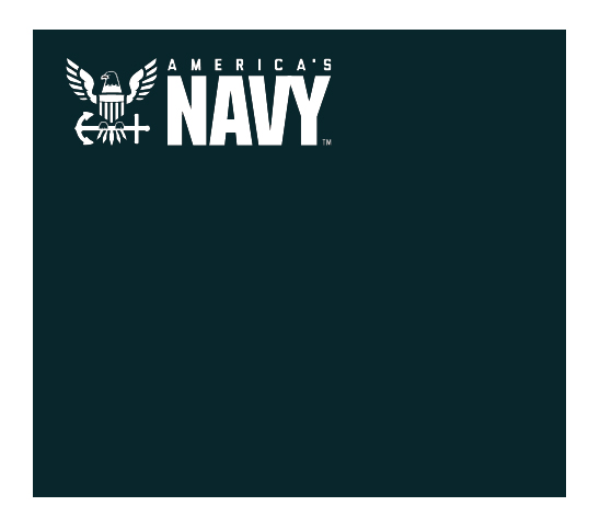
HEX: #08262C
CMYK: 89, 66, 60, 67
RGB: 8, 38, 44
HSL: 190, 69, 10
-
Navy Blue
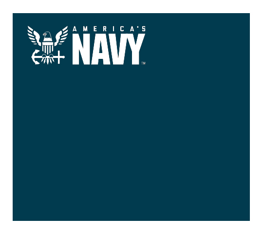
HEX: #003B4F
CMYK: 98, 69, 48, 40
RGB: 0,59,79
HSL: 195, 100, 15
-
Teal Blue
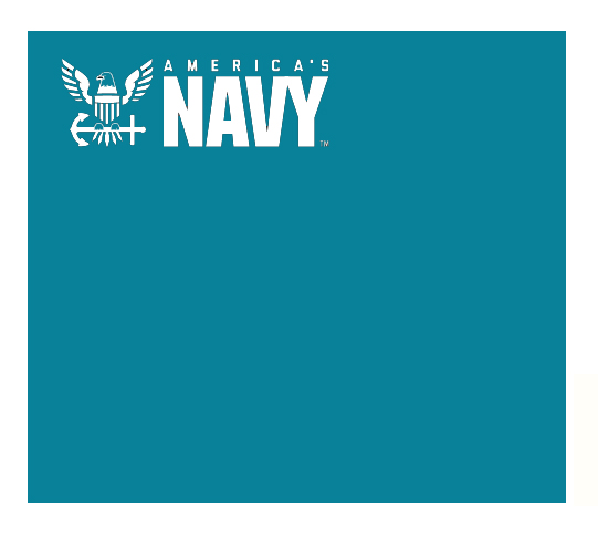
HEX: #088199
CMYK: 85, 36, 32, 3
RGB: 8, 129, 153
HSL: 190, 90, 32
-
Gray
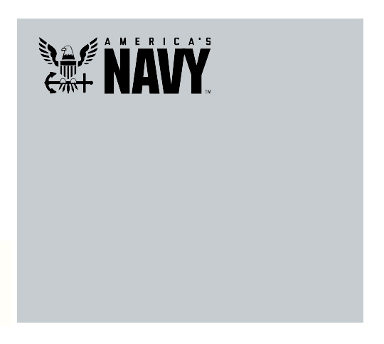
HEX: #C6CCD0
CMYK: 22, 14, 13, 0
RGB: 198, 204, 208
HSL: 204, 10, 80
-
Yellow
HEX: #E8B00F
CMYK: 10, 31, 100, 0
RGB: 232, 176, 15
HSL: 45, 88, 48
-
White
HEX: #FFFFFF
CMYK: 0, 0, 0, 0
RGB: 255, 255, 255
HSL: 0, 0, 100
Contrast & Accessibility
WCAG 2.0 guideline 1.4.3 requires a contrast ratio of at least 4.5:1 for text, with a few important exceptions:
Large text, defined as being at least 18pt (24px) or at least 14pt (18.667px) and bold, has a contrast requirement of only 3:1.
There is no contrast requirement for incidental text, defined as “Text or images of text that are part of an inactive user interface component, that are pure decoration, that are not visible to anyone, or that are part of a picture that contains significant other visual content.”
Passing Text Color Combinations
-
Navy Black +
- White (16:1)
- Gray (10:1)
- Yellow (8:1)
- Teal Blue - Large (3.5:1)
-
Navy Blue +
- White (12:1)
- Gray (7.5:1)
- Yellow (6:1)
-
Teal Blue +
- White (4.5:1)
- Navy Black - Large (3.5:1)
-
Gray +
- Navy Black (10:1)
- Navy Blue (7.5:1)
-
Yellow +
- Navy Black (8:1)
- Navy Blue (6:1)
-
White +
- Navy Black (16:1)
- Navy Blue (12:1)
- Teal Blue (4.5:1)
-
Red
HEX: #B30003
CMYK: 20, 100, 100, 13
RGB: 179, 0, 3
HSL: 359, 100, 35
Usage
Red should be used to provide specialized indication to alert, or any specialized attention that needs to be known.
To Contribute
If you are interested in contributing, please visit: https://usnavy.github.io/Navy-Design-Guide/
We need you!